What did the artists want to depict?
This page gives some thoughts about what the artists were striving to communicate in their catalogue drawings of the objects in Pitt-Rivers' second collection. As we have shown in the other page about 'accuracy' and in Pitt-Rivers own work, Pitt-Rivers' believed that art could represent 'Truth'; that it was possible for an artist to accurately represent a three dimensional object in a 2-d drawing. This belief is reflected in his employment of skilled draughtsmen to compile the catalogue after 1880. Of course, one must assume that the draughtsmen were not given carte blanche to produce exactly what they liked but were asked to produce images of a certain standard and type by Pitt-Rivers. Unfortunately his instructions (which may have never have been written down) do not survive so we are left with the evidence of what they achieved, but not what they wanted to achieve, or what Pitt-Rivers hoped they would achieve. We do not know how successful their output was judged to be though there are relatively few drawings which have notes attached to them indicating that they were considered to be poor, so we can assume that they were generally taken to be very good. Certainly today their standard is seen as very high. For other discussion of this see the previous page which discussed how 'accurate' the drawings are here and also the discussion of their methodology here.
Obviously the exact working methods of the assistants are not known but it is clear that great attempts were made to render the objects accurately, for example from the middle volumes an attempt to measure the scale is made with items being annotated '1/2' (one half actual size, presumably) etc. As the artists were also producing site plans etc to scale for the archaeological excavations, one would presume that they brought some of that methodology (and technology) to the task. You can see here how the depictions of the objects is different in the drawings from the photographs that were later taken by other sources.
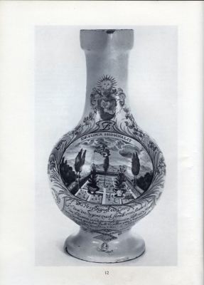
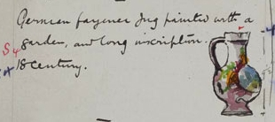
It is clear from matching the drawings to photographs of the actual objects that in some instances more attention was paid to the profile or outline of the object than to the accurate depiction of particularly noteworthy points about the object. For example in the two first images on this page are shown a German jug [Add.9455vol2_p127 /3] and the photograph subsequently taken of it for a Sotheby's catalogue some 70 years later. You will note that the photograph is black and white and it is only in the textual description (given below) that reference can be made to the striking coloration of the jug. The drawing is much better on the coloration aspects but its textual description is poor and the drawing concentrates more on the shape of the jug and its handle than its most striking feature - the image of the garden. The garden though is the thing that the Sotheby's painting concentrates on, presumably the aspect of the jug they thought most appealing to potential buyers.
“AN EXTREMELY RARE GERMAN FAIENCE HAUSMALER JUG (Enghalskrug) decorated by Bartholomäus Seuter of Augsburg, the jug of pear shape with cylindrical neck, loop handle and heart-shaped mouth, in the centre of the body an oval panel painted with an allegorical subject, a hand piercing the clouds pours water on to a formal garden below a ribbon label inscribed DESUPER HUMORALIT, below the panel a verse in German, flanking it palm leaves enclosing the initials L.Z.H. in black on a seeded yellow ground, on the neck a baroque coat-of-arms with shield and crest, on either side goldfinches perch on fruiting vine and below them flutter moths, simulated pink ribbons join the handle to the body, 9 ¼in. high, c. 1720
*** This hitherto unrecorded addition to the Seuter oeuvre has several features which link it to other pieces attributed to Seuter and his workshop. For example the colour scheme with its crimson, egg yellow and bright green and blue recalls the celebrated signed jug, dated 1717, in the Hamburg Museum für Kunst und Gewerbe (illustrated in colours by Pazaurek, Deutsche Fayence-und Porzellan-Hausmaler, vol. I, col. pl. 6, opp. p. 92); this jug also has the same arrangement, with the coat-of-arms on the neck and with the birds perched on foliage. Compare also the tall jug illustrated on pl. 12 of the 1925 Frankfurt Exhibition Catalogue, nos. 49, 50, 51 and 53. Butterflies and moths are seen again on an Enghalskrug in the collection of Mrs. Lola Kramarsky, illustrated by Ducret, German Porcelain and Faience, col. pl. 155 Bartholomäus Seuter, 1678-1754, was perhaps better known as a decorator of Meissen porcelain, in particular the gilt chinoiseries. For Seuter’s work on porcelain see lot 156 in this sale (See ILLUSTRATION) [Sotheby’s Catalogue of Important Continental Pottery and Porcelain ... Tuesday, 24th May, 1966 lot 12]
The jug eventually sold for £3000 (the sum was hand written in the catalogue of this sale previously owned by the Pitt Rivers family).
Judging by the comparison of other Sotheby's descriptions and photographs to the catalogue drawings this seems to be generally true. For example Bellarmine jugs with faces on the side of the necks, are shown with the heads in profile, showing only as a shaped lump on the side rather than showing the detail. Perhaps this is because shape and colour of objects is the detail that would be noticed when objects were being searched for from a distance, if for example their location was being sought in a display or store room?
The contrast between what the draughtsman chose to depict (or was instructed to depict) and the radically different angle taken by Sotheby's suggests that they had different aims in mind. The purpose of highlighting shape and proportion might have been about easily matching physical object to depiction, that is - the drawing was serving as a form of catalogue in and of itself. Alongside the textual description this provides the equivalent of an accession register record for a museum object. Sotheby's, by contrast, want to attract people to the image of the object in order to make them buy it - a very different task.
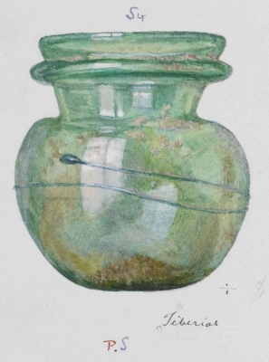
However, the draughtsmen definitely employed artistic skills to represent how the reality of the object struck them rather than necessarily only reproducing what was necessary to give an impression of the object. They could have drawn entirely flat representations in line only, for example, but they chose not to. An example of the additional detail they added in order to represent the 'physical reality' of the objects is that they sometimes showed shadows and reflections, as in one of the illustrations on this page. This enhances the illusion of a 3-d object and gives more allure to the object for the viewer.
AP with Corinna Gray February 2011
![]()